

Client: Marine Cambie Dental
Strategy: Latitude Agency
Creative Direction: Latitude/Chris Young
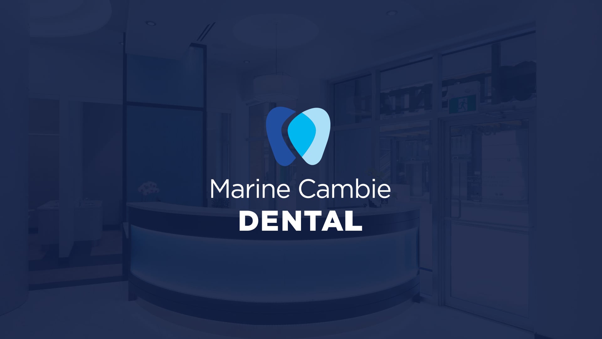
Marine Cambie Dental
PROJECT DETAILS
Art Direction: Latitude/Chris Young
Design: Chris Young
Production: Chris Young
This project was completed while working at Latitude Agency.
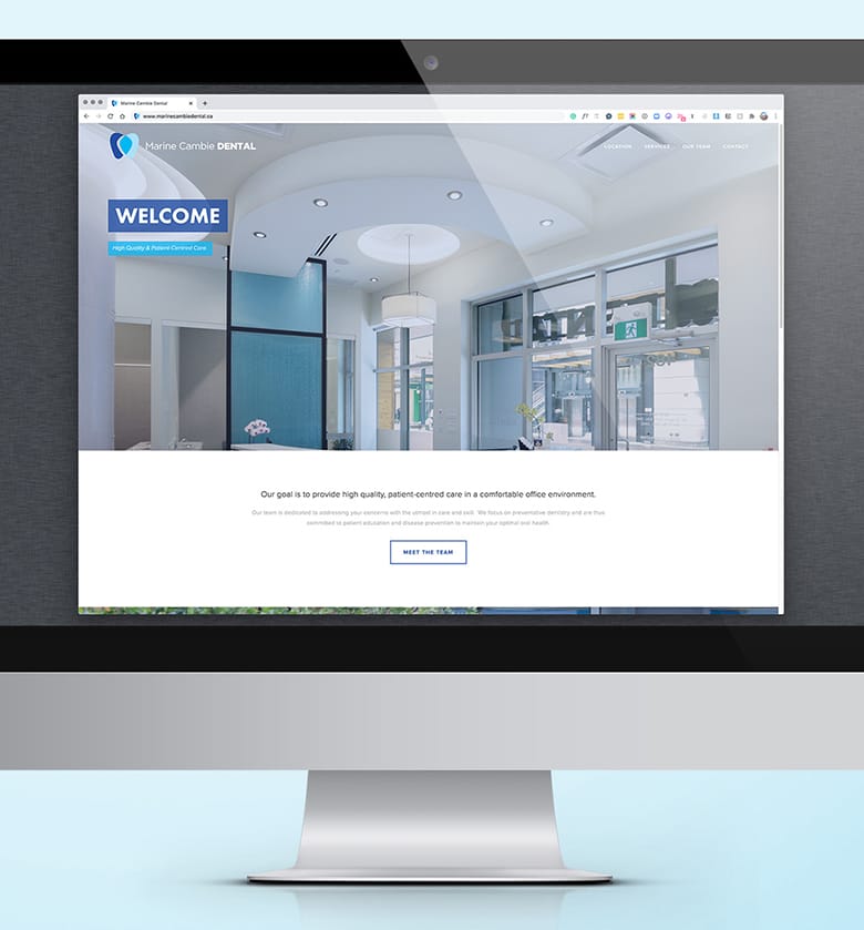
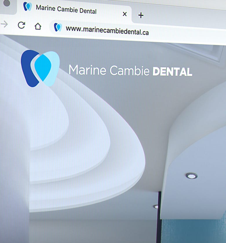
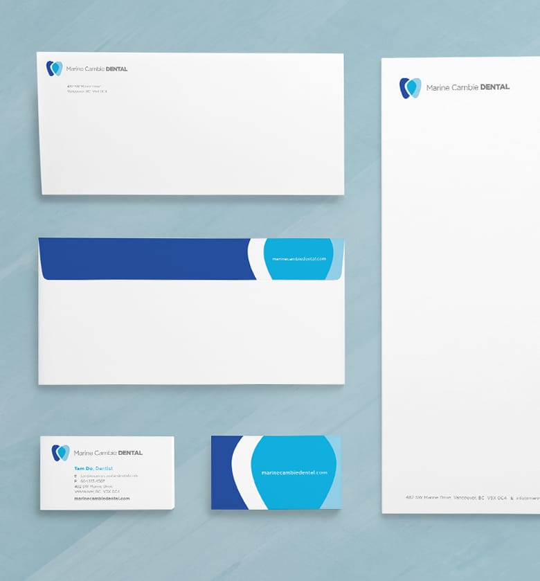
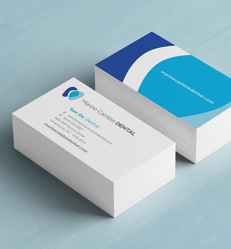
Marine Cambie Dental approached Latitude to create modern branding for their new dental facility at the Marine Gateway development. This included a logo identity, collateral, signage and website.
The new dental office features a bright and modern atmosphere, and they wanted to ensure that our brand reflected their design sensibility.
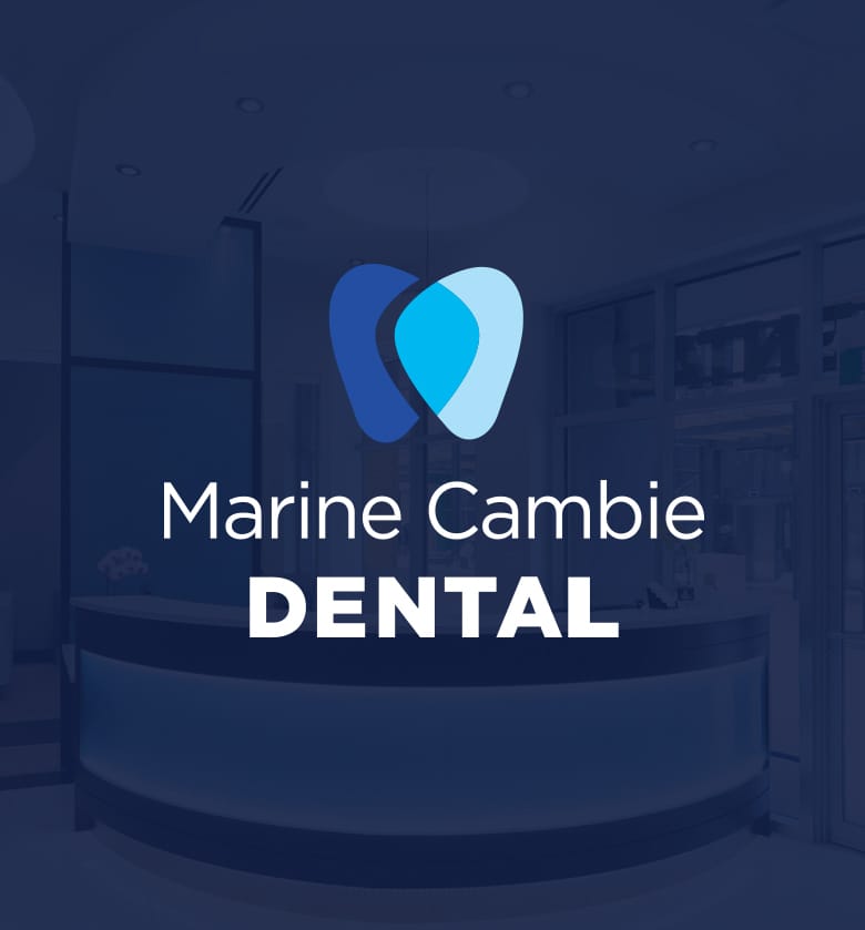
Logo Design
When coming up with this logo concept, I started with a pencil and paper and took many different approaches. By the time we had a ‘tooth’ logo in the mix, I had worked on sketching out several different versions, purposely deciding not to use a simple tooth shape, as we’ve all seen that solution everywhere we look. I had probably sketched out a couple of hundred tooth-like shapes, and I kept returning to a loose ‘loop over loop’ style of tooth design. We went through several iterations of this logo concept before we ended at this final solution. We pushed away from a really generic tooth shape and allowed for a bit of freedom to allow the logo illustration to have a modern look, with a free form, and represent a more stylized tooth rather than a basic tooth.
We presented our top three choices for logos to the client in the first part of our presentation. But this logo was not in those first three choices, but we had a few additional options that we felt still had some relevance and included them at the end of the presentation as points of discussion to show other avenues we had explored.
I don’t often include these ‘additional choices’ at a first look logo presentation, but something felt right about this one. After the client had seen the first three logos, he had a standout choice, but he wasn’t in his happy place yet. We showed the next page of the presentation, and this logo jumped out immediately at him. I had been rooting for this logo concept all along because it was more in line with some of the reference material that the client shared with us at an earlier meeting.

![]()


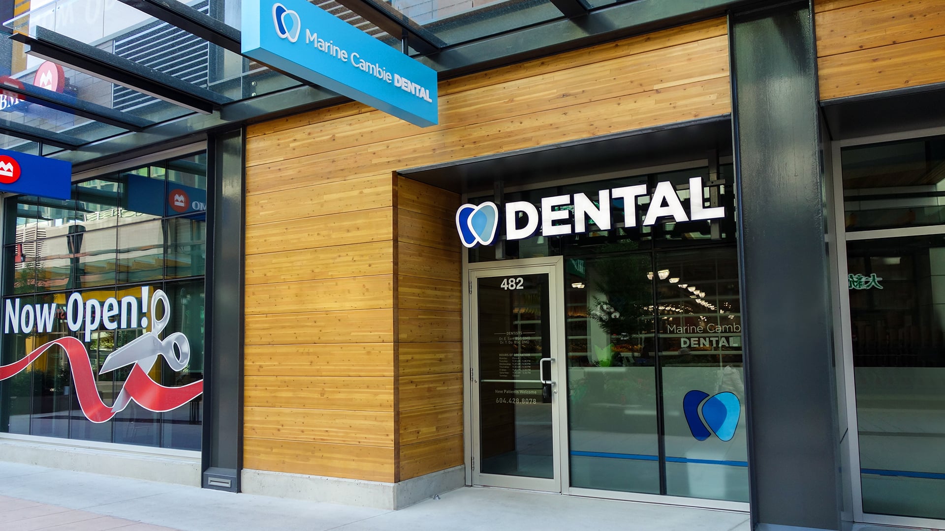
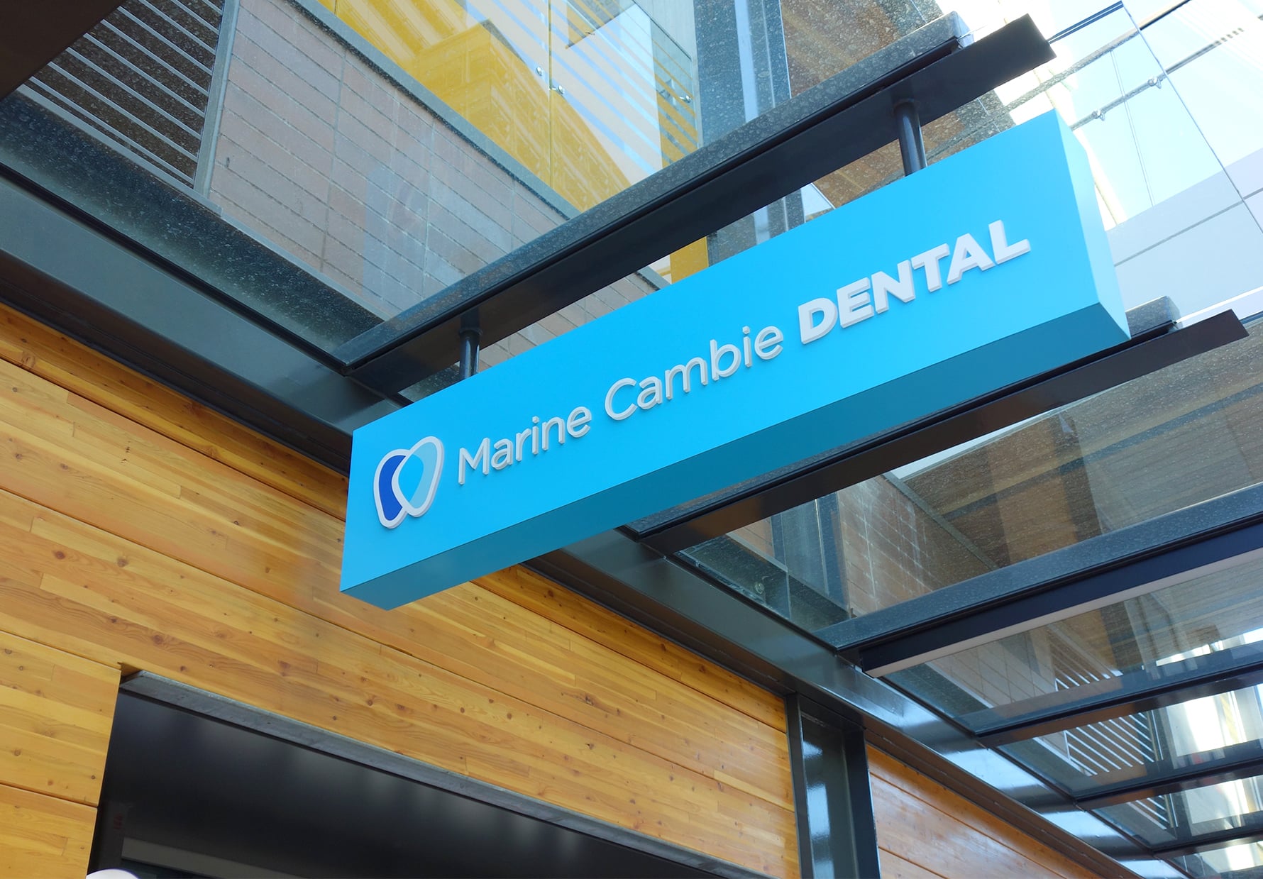
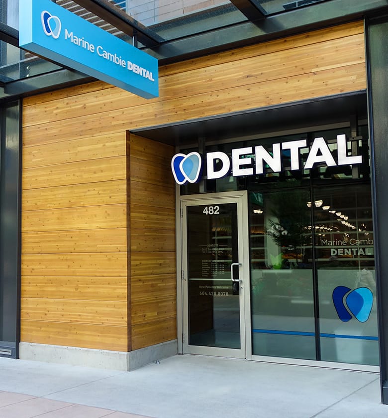
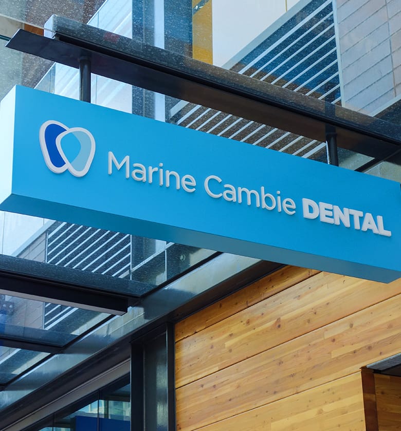
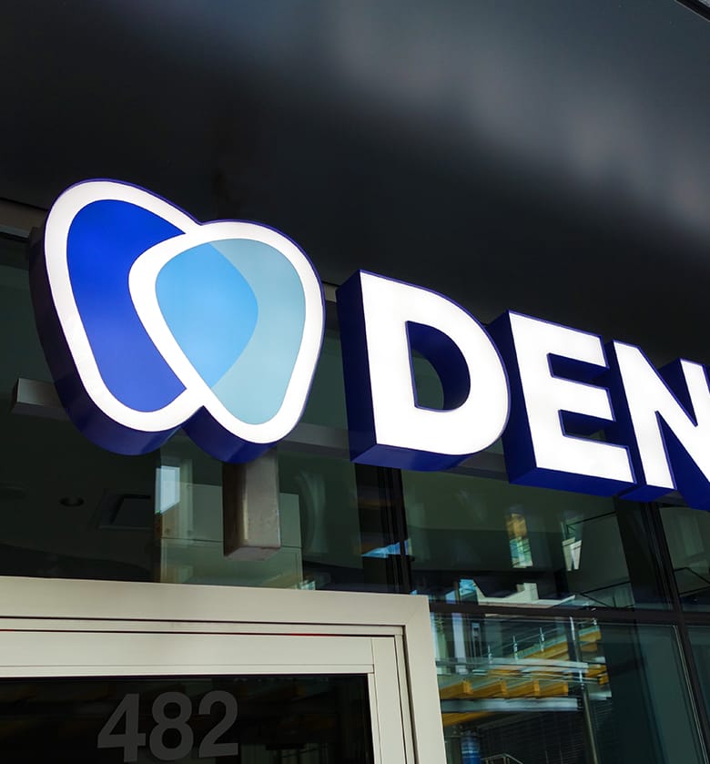
Signage
The client wanted the modern style of the logo to really come across in the signage. This was a brand new multi-retail outdoor mall environment, and the walk by traffic was a key consideration for how we’d be approaching the signs.
This project’s signage component had a mix of channel-lock, backlit vinyl and on-window vinyl sticker applications. Since this was a brand new development that had not been completed yet, we worked from the developer’s blueprints and renderings. So while you’re working blind, you have to put faith into what you’ve designed months before it’s completed.
Since this was a large-scale brand new development, all the signage had to be signed off by the developer/landlords and the client, as they are looking to launch with all the stores looking great right off the launch. So there was a little back and forth, but we completed this process about as smoothly as it could be.
![]()

![]()
All work copyright Marine Cambie Dental, Latitude Agency and their respective owners.


