
Client: What’s at the Market
Strategy: Tugboat Group
Creative Direction: Tugboat Group
What’s at the Market Website Design Updates
PROJECT DETAILS
Art Direction: Chris Young
Design: Chris Young / Tugboat Group
UX/UI: Chris Young / Tugboat Group
Work completed while employed at Tugboat Group.
The What’s at the Market website connects shoppers to farmers’ markets in their area, making busy people’s life easier by removing the guesswork of which vendors will be at which markets, and what products they’ll be selling.
With the rising popularity of farmers’ markets across the Lower Mainland, WATM is a win-win-win solution for shoppers, vendors, and market organizers. Shoppers follow their favourite markets and receive email notifications the day before the market with current vendor and product information.
At the time of my involvement, the original version of the website had already been live for some time, and the website was picking up steam with farmers’ markets rising in popularity. This website was a project I was excited to work on because I shop at farmers’ markets frequently. For the redesign, it was recognized that the site was missing personality, and I was tasked to review the UX/UI, and spruce up the UI to make the site more usable and friendly for the market community audience.
Working closely with the developers on the site UX, we focused on making the site easier to use and rethought filtering functionality so that users could quickly find relevant information.

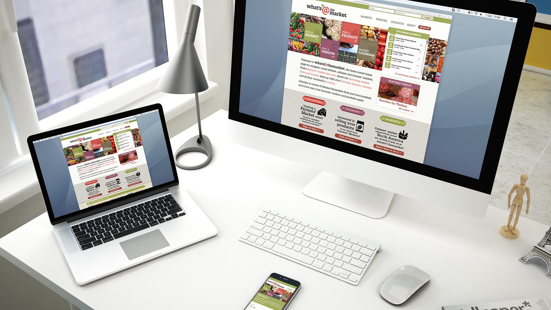
The Homepage
The original version of the website was simple but missing personality, and the main functionality was an email sign-up for individual market e-newsletters. The revised site was designed to include an expanded list of farmers’ markets, vendor descriptions, and product highlights. With the additional content, the website needed a clear call to action for each of the three main user groups: shoppers, potential vendors, and market organizers. Shoppers are directed to sign up to receive emails, vendors are prompted to apply to attend a market and market organizers are encouraged to join the website.


Markets page
I added some organization and functionality to search through markets, vendors and products. The markets are organized by city, helping shoppers find markets closest to them. They can also follow as many additional markets as they desire to receive updates from. In addition to the search functionality, markets can be selected by location on an interactive map.


Vendors page
Robust search functionality and filtering to sort hundred of vendors make the new site much easier to use. If a shopper is not sure of the name of a particular vendor from a particular local market they can search by category to drill down and find that vendor.


Products page
This section of the website provides an overview of the products available by each vendor. We built in the functionality of being able to add specific details about products including, descriptions and ingredient lists. It’s up to each vendor to input information about their product line. I did some exploratory conceptualization of what the site could look like with a heavier product focus; see screen captures below.


Calendar
After researching several calendar apps, I added visual feedback of how many markets would be happening on a particular day right on the calendar. If there was just one market on that day, one box would display – adding up to 3 boxes to represent a busy market day. This makes it obvious to the user by glancing at the calendar, and they can see patterns emerge; Saturdays and Sundays are very busy days, Wednesdays and Thursdays show single markets happening on those days; whereas Mondays, Tuesdays and Fridays tend to be slower in the market world.


Pre-Market email newsletters
One of the main features of the What’s at the Market service is timely email reminders, sent the day before a market. These HTML emails, designed to match the new look of the site, contain all the information you’d want to know before heading to the market including map and location details. When there are special events or seasonal notices attention can be brought to relevant information directly in subscribers’ inboxes. A detailed list highlighting participating vendors and the products they’ll have for sale on that day are included.

DISCLOSURE | At Tugboat, the design department works closely with each other, and with the web developers, so I want to be clear that while I’m confident in showing this website in my portfolio as the majority of the UX/UI design work is mine, there is some design elements and graphics shown in the images above that is not my work. That’s why I’m showing my original design work as much as possible that may no longer be live on the site because it has been updated as part of the website’s progression.
All work copyright Tugboat Group and their respective owners.


