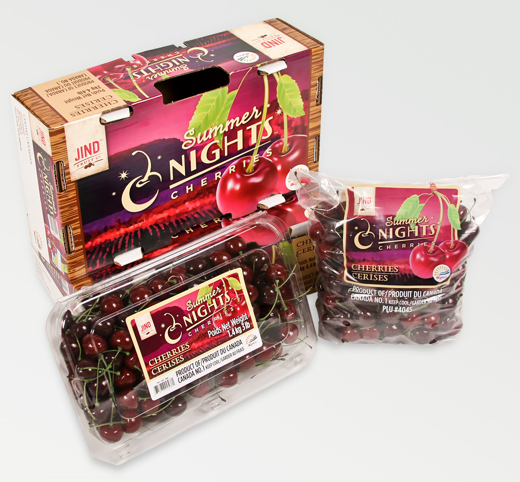
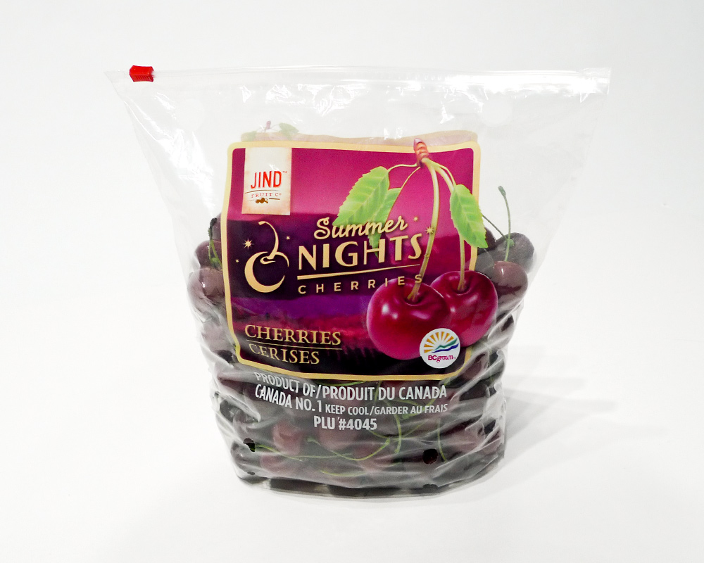
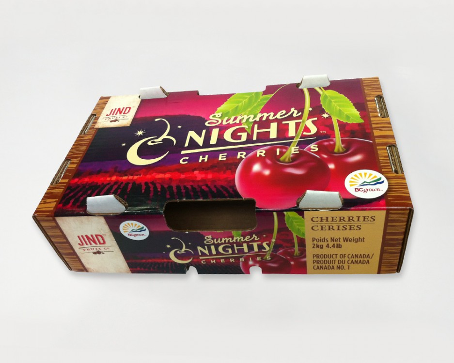
Summer Nights Cherries tray.
Client: Jind Fruit Co.
Strategy: Tugboat Group
Creative Direction: Tugboat Group
PROJECT DETAILS
Client: Jind Fruit Co.
Strategy: Tugboat Group
Creative Direction: Tugboat Group
Art Direction: Tugboat Group / Chris Young
Design: Chris Young
Production: Chris Young
Work completed while employed at Tugboat Group.
With a Buyer’s Guide, website and a few packaging components completed, much work was to be done to design boxes, trays, clamshell labels and bags for Jind’s full product range.
A vintage look and feel for the Jind Fruit Co. brand had already been established through our team’s earlier design work. This new packaging continued to refine those summer themes; summer nights, summer love, and summer flings. This vintage feel would be a little softer, more romantic– confident, but not trying too hard.
With a creative platform already established, we were able to move through our deliverables list in the order that the produce would come off the trees. Starting with the multiple Summer Nights™ Cherries boxes, clamshell labels and bags; then Summer Love™ Peaches boxes and trays; multiple Summer Fling™ Select Fruit (nectarines, apricots, Italian prune plums and grapes) boxes and trays; and finally Summer Breeze™ Apple boxes.
The Jind brand leveraged printing on brown craft paperboard stock and International Paper’s ChromaPak printing process ( learn more about ChromaPak printing below ), which gives the packages their vintage look. It also introduced its own set of challenges. Using ChromaPak, the images and graphics are split into different colours and use special opaque inks that work better with the craft paper. There was quite a learning curve to this technique, and each image required special work to make them print well. Our printers really had their work cut out for them on these boxes and admitted that this was some of the most intricate work they’ve ever printed.


ChromaPak printing is a proprietary colour separation and printing technique of International Papers’. Unlike traditional offset printing that uses transparent CMYK inks (and spot colours), GCMI inks are opaque and sit on top of the brown craft paper better. The boxes were printed using the ink breakdown of Jind Red, Jind Brown, blue and yellow inks. With no black ink used, this softened the tone of the images, making them warmer, which helped create the imagery’s vintage appearance. This was a limitation we took advantage of, although some testing had to be done in advance to ensure the quality we had envisioned for the end product. One other limitation we had to get over was a minimum of 9pt overprinting stroke anywhere 2 colours touched (that wasn’t a halftone image) because of how much these boxes ‘rattled’ on the press. This led to a rethink of some design components that ended up working to our advantage, creating vintage ‘stamp’ style graphics on the logo marques and graphics. This thicker stroke really shines on the large sub-brand logo marques on the main panels of the box.

The ‘export’ version of the Summer Nights Cherries box (shown above) was offset printed on a white paperboard for export to India, where it had to have a bright pop and clean colours. India’s market demands a bright white box to showcase a premium product from the other side of the world. The Summer Breeze Apple boxes also were printed on a white paperboard box for the same reason.

See also the Jind Fruit Buyer’s Guide and my First look at the Jind Fruit packaging.
DISCLOSURE | While I did design and produce almost all of the Jind Fruit packaging shown here, I did not design it alone. This was a large job, with tight timelines, and longer than usual turnaround times due to the proprietary ChromaPak printing process and thus all of us in Tugboat’s design department had a hand in the design, and much more so, the production of the roll-out of boxes. I designed the first boxes and clamshell label– establishing the look and feel, and ensuring the standards for the CFIA compliant text were implemented. I worked closely with the printer to ensure our vision would come to life. From there, I oversaw the final work, double-checking CFIA compliance for all the text and content legal requirements, and continued working with the printer to ensure consistency across more than a dozen boxes, clamshell labels and bags.
All work copyright Jind Fruit Co., Tugboat Group, and their respective owners.