
Client: Vantage Seniors Living
Strategy: Kimbo Design / Chris Young
Creative Direction: Chris Young / Kimbo Design
PROJECT DETAILS
Client: Vantage Seniors Living
Strategy: Kimbo Design / Chris Young
Creative Direction: Chris Young / Kimbo Design
Art Direction: Chris Young / Kimbo Design
Design: Chris Young
Production: Chris Young
Project was completed while working at Kimbo Design.
They also wanted to improve their web presence, by offering a clean and intuitive new website, aimed at their growing and technologically savvy target audience. We were excited by the scope of this project, as Vantage Living has senior living communities all across BC and Alberta, which provided great exposure for our new branding.
Visit the website at VantageLiving.ca.
Please note that there have been some updates to the site since its launch that have changed, so it’s not a great representation of what I originally designed.
Vantage Living’s old name, inSite, and the brand had remained the same over its many years of operation, while the company itself continued to evolve and grow beyond this initial scope. No longer reflective of what the company had grown to become, the brand was slowly relegated to internal documents and small elements in each building; whereas what Vantage Living’s leadership wanted was a strong and vibrant visual identity, which they could be proud of, and use to tie together all of the company’s assets. Thus, we wanted to create a modern and clean look to match the dynamic lifestyles of Vantage’s clients, who are distinguished by their drive to enjoy every instance of action in life.

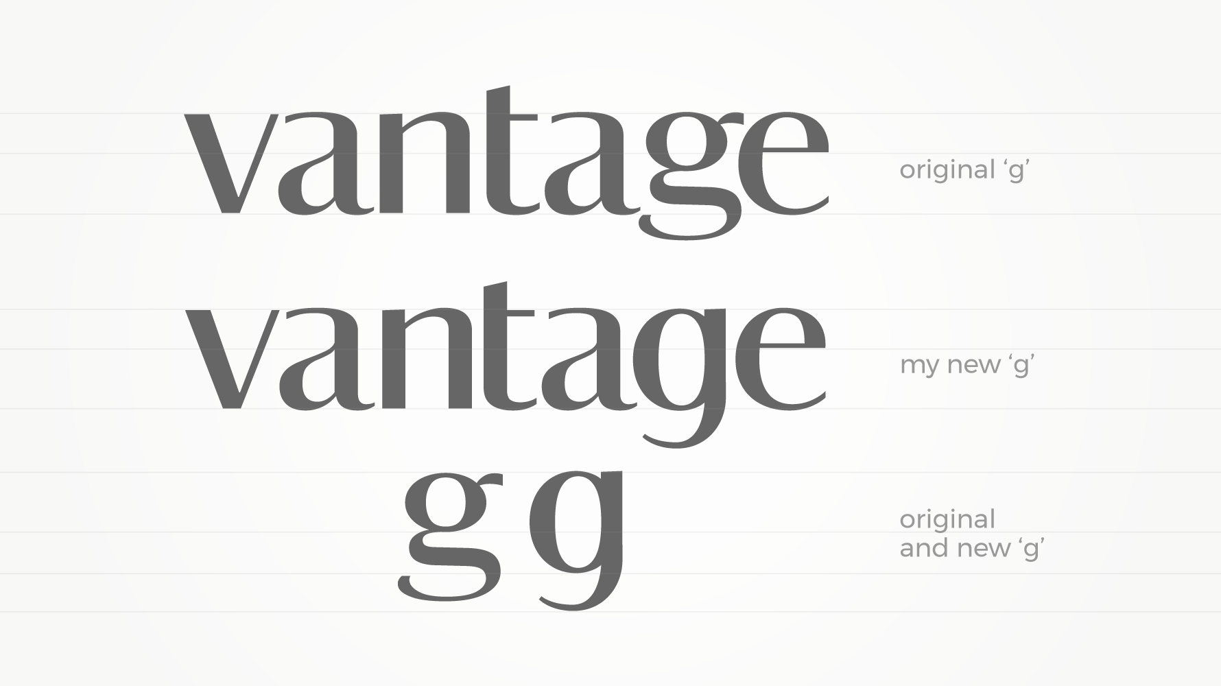
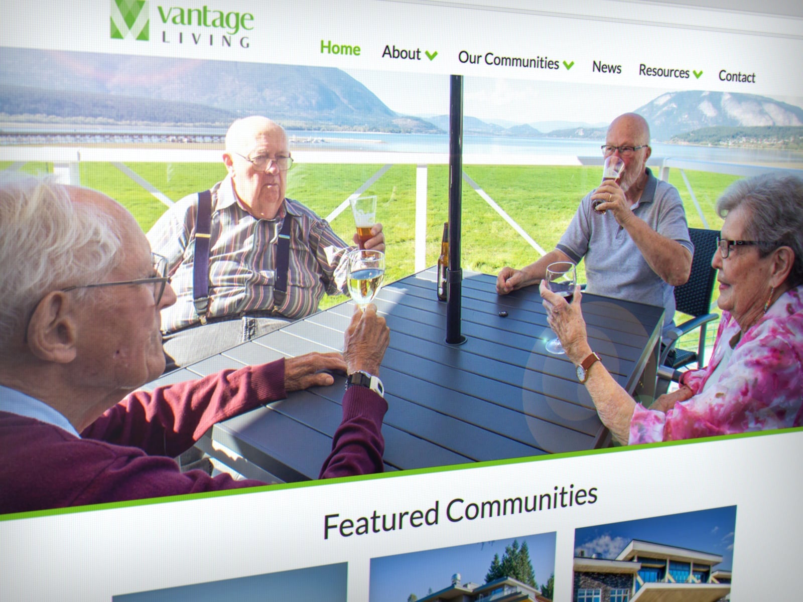
Our multi-dimensional arc logo design evokes depth, modernity, and simplicity. Paired with a contemporary, high-contrast font, the logo establishes a lively visual identity. The Vantage Living typeface is a customized version of Darby Sans Poster, the typeface originally created for Wallpaper magazine. Our website design features beautiful lifestyle-oriented photography, with accessibility functionality throughout.


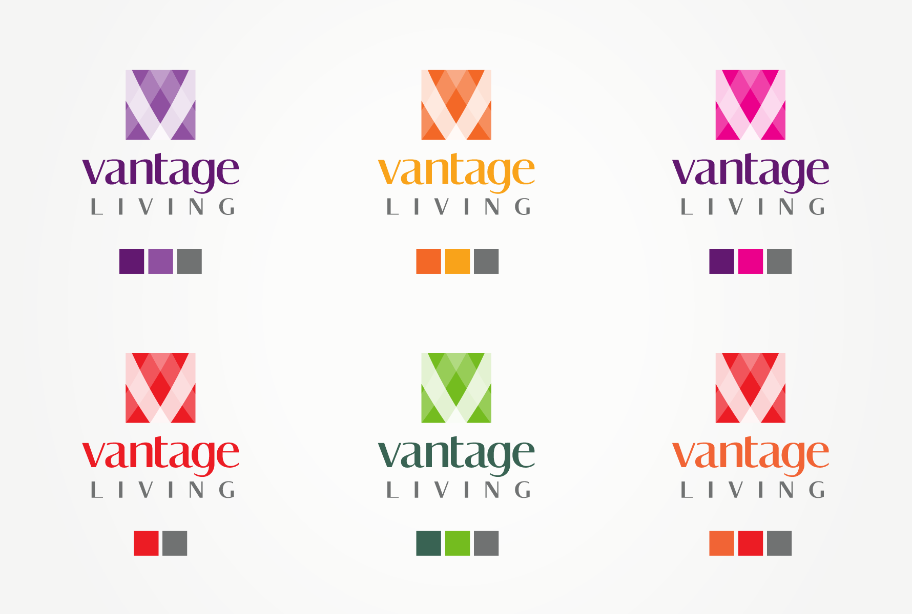
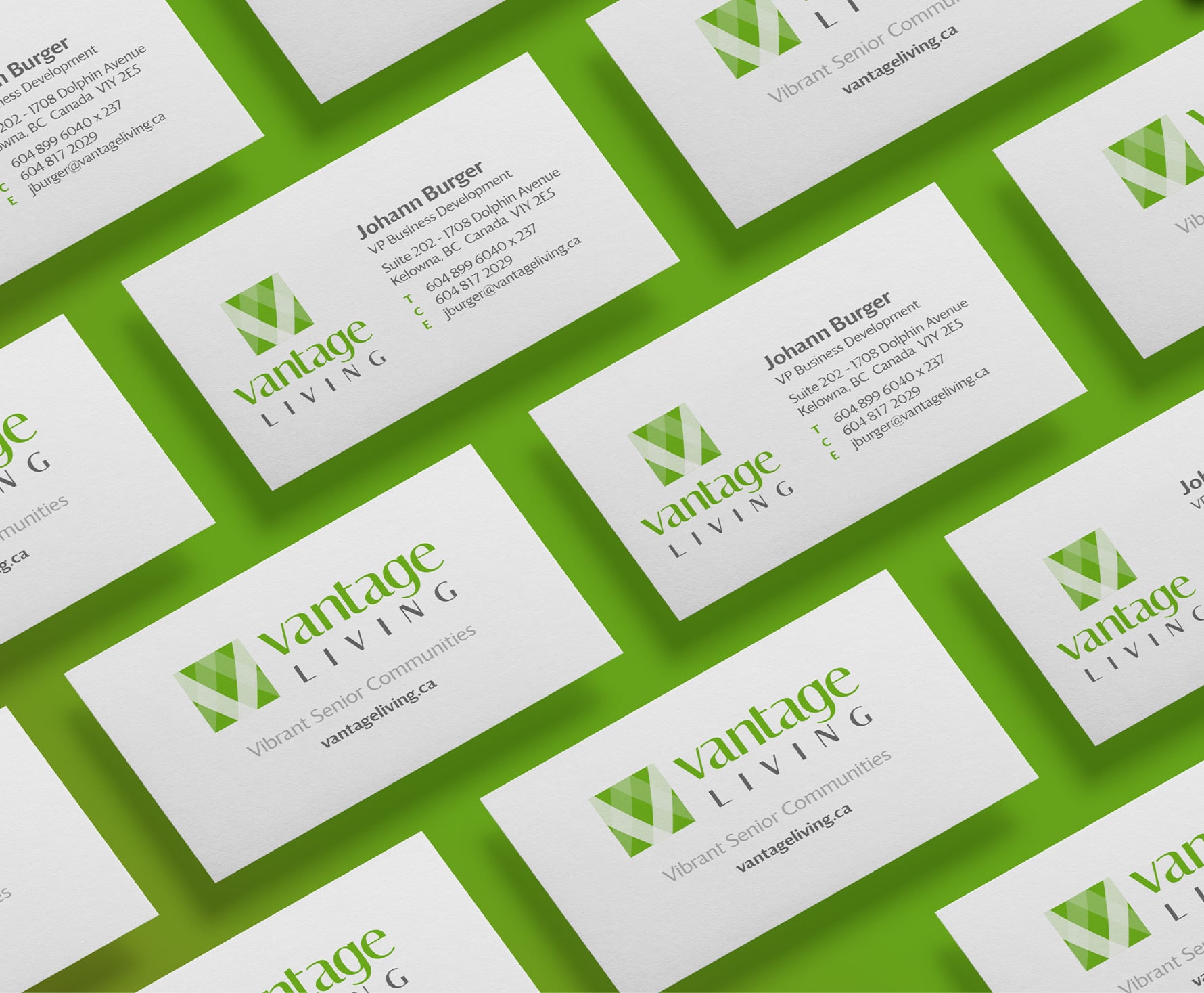

For Vantage Living, we produced a complete brand identity, including logo variations, brand elements (internal documents, signage, uniforms, etc.) a style guide to help them apply the brand as we intended, a shuttle bus and a responsive website.
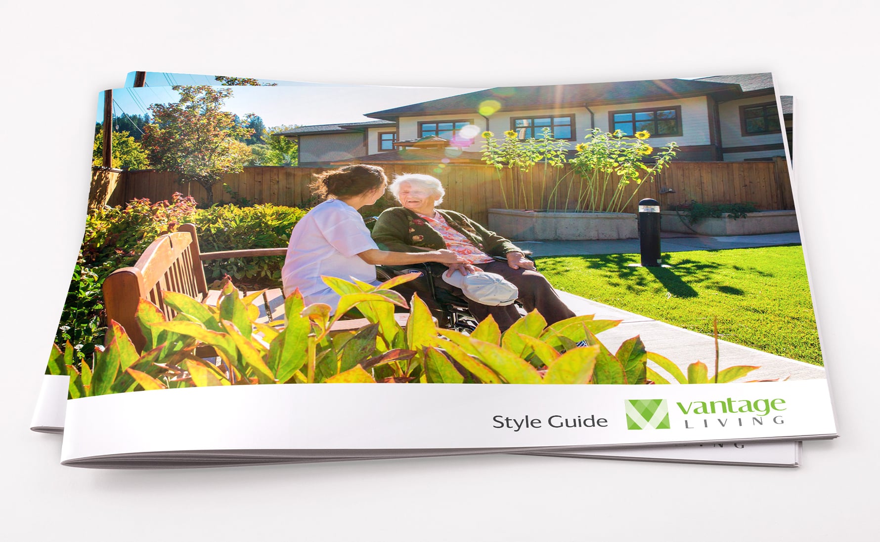
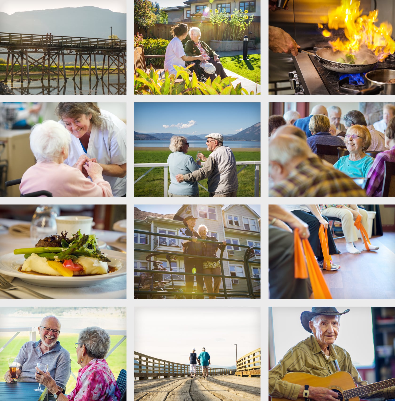
What we wanted to achieve with this project was to create a new beginning for a company with an established history of providing excellent senior living residences. We chose a colour palette anchored on a bright, lively green. These were the characteristics of the ideal Vantage client, and we knew these people would identify with the youthful spirit that our design exuded. Working with a lifestyle photographer, our design and website also utilized beautiful photos of real community members and staff to breathe life and personality into the brand, as well as some drone footage as the centrepiece of the home page.
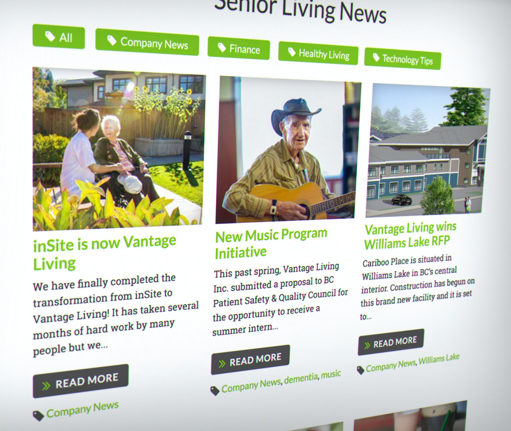
I designed the website from the ground up, doing the UX/UI and right through to the final design. I started by creating the Information Architecture, putting together a sitemap, laying out the wireframes, and moving into the site design. I worked closely with the client to bring their vision to life.
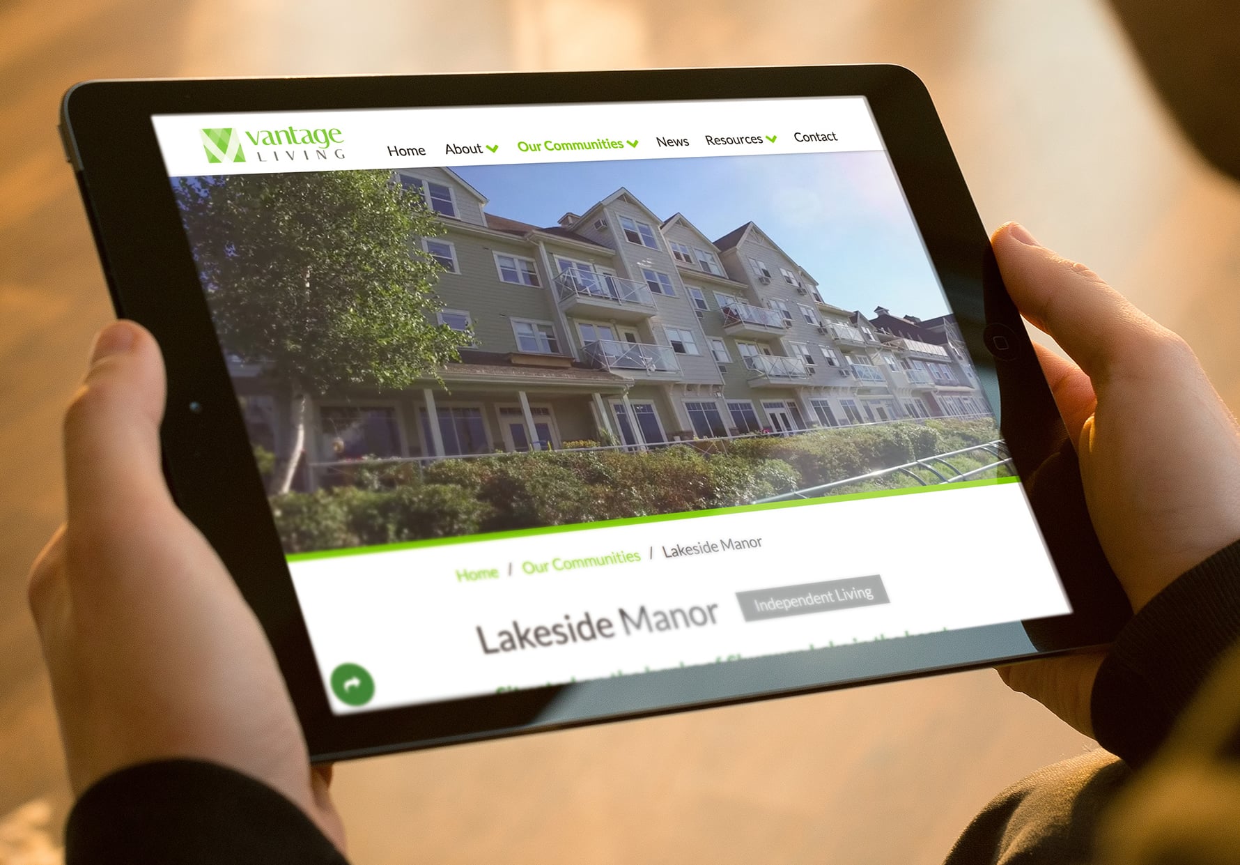
Knowing that our audience would skew older, we purposely made the website simple and intuitive to navigate and kept the text as brief as possible. We made the text a couple of pixels larger and included a text resizer for accessibility so that users could fine-tune to their preferences.
We ensured that the website met the highest accessibility standards, as the target demographic for Vantage Living trends toward older age groups.

Visit the website at VantageLiving.ca.
The Vantage Living staff were incredibly excited to implement their new branding in all of their communities, in the ongoing quest to improve the lives of their residents.
All work copyright Vantage Living, Kimbo Design and their respective owners.
— PRIVATE PORTFOLIO —