

Client: FarmFolk CityFolk
Strategy: FarmFolk CityFolk / Chris Young / Kimbo Design
Creative Direction: Chris Young / Kimbo Design
— PRIVATE PORTFOLIO —
FarmFolk CityFolk Identity and Website Design
PROJECT DETAILS
Art Direction: Chris Young / Kimbo Design
Design: Chris Young
Production: Chris Young
Project was completed while working at Kimbo Design.
FarmFolk CityFolk is BC’s oldest and largest food and agriculture charitable non-profit organization. They have been working to inspire and equip people to eat food that nourishes themselves and the planet since 1993.
An intensive website redesign that brought three separate websites all together in one place. The website includes a refresh of their brand identity, colour palette and a fresh, modern look to their organization. The website has lots of great new functionality including an Events section, multiple landing pages for their Programs, and an advanced Resources area.
Visit the website at FarmFolkCityFolk.ca.
Refreshed FarmFolk CityFolk logo
FarmFolk CityFolk came to Kimbo Design looking for a modern refresh of their logo, as part of the new website design. They have a lot of brand equity in the forks component of their logo, so they came to us with an updated version of the dinner fork/pitchfork as a line illustration. We liked and agreed with the new direction of the icon, so I started from that point, refining the icon, changing the orientation to have the forks pointing upward instead of downward to be more uplifting.
I paired the forks icons with dozens of typefaces to explore the new direction of their look and brought a small exploration study back to them for discussion. FFCF was very hands-on and very involved at every stage of the rebrand, and so they wanted to ensure that they saw themselves and the future of their organization in the new logo.
![]()

A few of the different logo formats, horizontal, stacked, reversed and the FarmFolk CityFolk colour palette.
![]()


Website Design
Much like with their logo, FarmFolk CityFolk had long outgrown their website that was very outdated and non-responsive, which did not reflect who the organization has grown to be. They knew that undertaking this website redesign would be a lot of work, so they began planning for this before well before contacting Kimbo about the job.

They wanted to improve and modernize the site’s functionality so that it could do more for them. FFCF wanted the Communications streamlined to concentrate on the important work they do. One key area of their site that features the Communications work is their ‘Stories’ page; this news/blog page features a simple grid display of cards featuring their latest news. In the backend, it’s complex, organized categories of the website so that the highlighted Stories that appear at the bottom of each page are relevant to the page where they’re displayed. You’ll see that best on their Program’s pages, such as the Engaging Eaters content under their Climate Solutions program.

Their organization and planning really paid off as they were almost done with all the writing and already had a very good idea of how the sitemap was going to be.
I worked closely with their team’s project coordinator to offer advice and refine their sitemap before moving on to the wireframes process.
The FarmFolk CityFolk website looks quite simple and straightforward at first glance, but if you start digging into the details, you’ll find a robust website with slick, modern functionality that puts this new site light years ahead of where their old site was.
Not only did we collapse three separate websites into one, but we also went over and above in delivering some incredible features and functionality that will serve their organization well for the years to come. At first glance, this seemed easy enough, but as I started talking to their team about some of this functionality, all of our conversations went long and deep – very deep about what they were hoping we could do for them. I can really sink my teeth into these kinds of details.
We wanted to ensure that the two separate websites that we merged with this new site had enough presence on the page so that they wouldn’t just become ‘another inside page.’ We mirrored our new homepage and used those layouts for these inside pages. This way, when users type in those other URLs when redirected to the new site, they aren’t just landing on an inside page that doesn’t have as much impact as these homepages we built. We did these based on the new homepage; see the BC Seed Security page and the Feast of Fields page – their long-running annual fundraising event.


Community Supported Agriculture
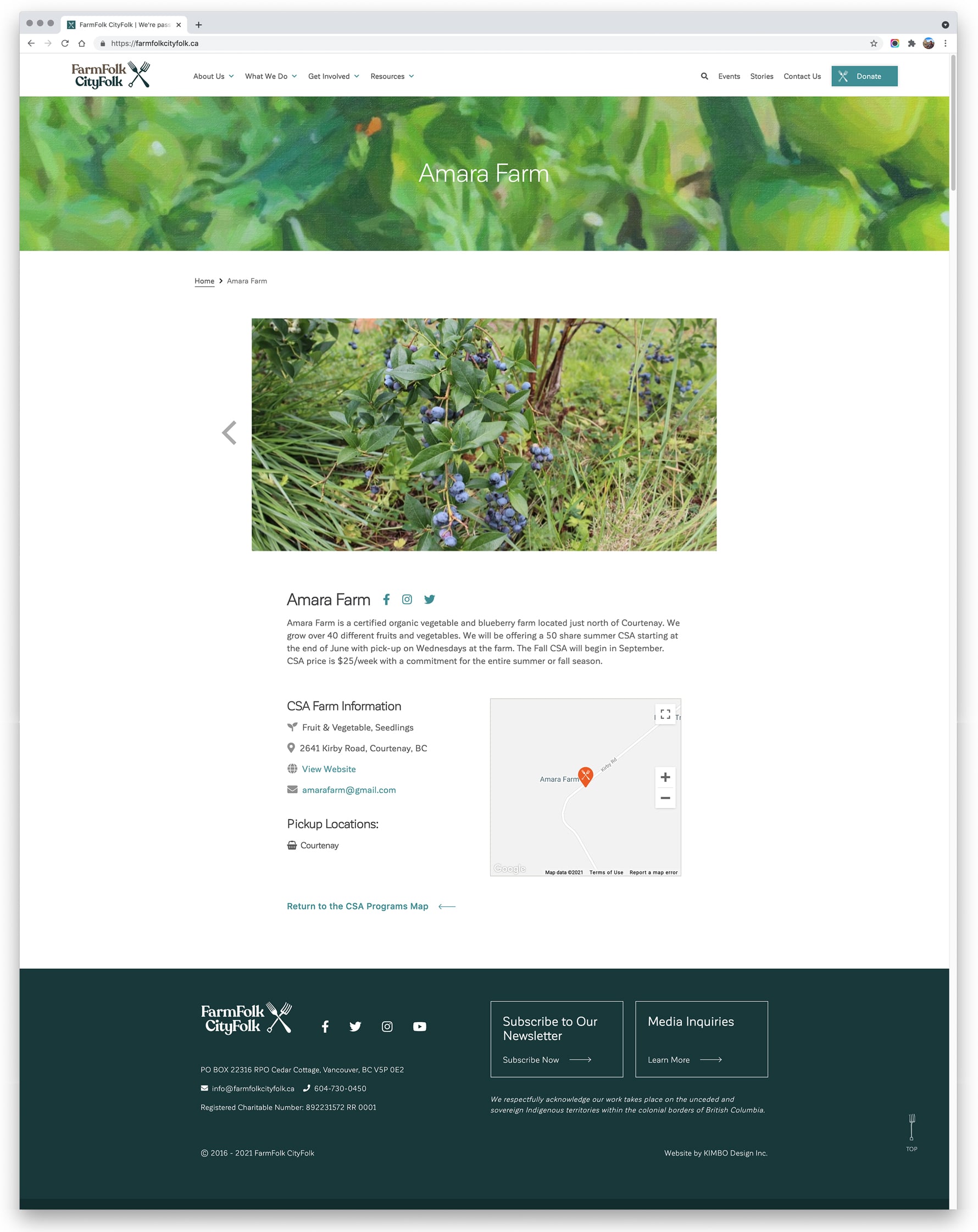
One area of significance on the new website is the Community Supported Agriculture section. This page was the most visited page on their old website, but they never felt that page was doing the job that it should be. The old website’s CSA page wasn’t much more than a very long list of the participating farms, with a basic filter for its region.
What is a Community Supported Agriculture (CSA) Program?
Community Supported Agriculture is a program where customers purchase ‘shares’ in seasonal harvests from their local farmers. This mutual commitment guarantees consumers repeated deliveries of fresh, local food, and provides farmers with a source of income during a period of high expense. Farmers increase their financial and environmental resiliency by incorporating the CSA model into their business.
– FarmFolk CityFolk website
I took a fresh look at this important part of their website. FFCF was hoping to include a map that showcases where the participating farms are; that was easy to deliver, and that’s where I thought through how their users would want to use this kind of tool in 2021. COVID-19 has put a huge focus on food security, and interest in CSA’s spiked this year; I wondered if we can make this a frictionless process, would people stick with it after returning to our post-COVID lives? Their CSA regions were a cobbled-together mess with input from many people over the years, so I suggested we start by using Destination BC’s regions; they work well for this, and they’re easily understood.
Visit the CSA Map page to see the functionality shine; users can filter by CSA Region, CSA Type (crop/products offered), and Pickup Location. We highlighted the numbers in the sidebar to have a better overview of the information, and users can also take advantage of Location Services on their devices and let Google Maps find their location. Any filtering applied in the sidebar changes the map in real-time.
The Pickup location had originally been earmarked as a future feature, but we were able to add this in time for the launch, which made the client ecstatic. Pickup locations are where Farms drive their products to other cities for the convenience of their clients; they can pick up at a central location to save them driving long distances to the farm’s location, often in the Valley or further into the Interior of BC.
Below you can see the CSA Map page on the left and an example of a Farm Profile on the right.

Resources section
FFCF wanted a place to house the decades of knowledge, research, white papers, manuals, instructions, videos, recipes and the archive of their now out-of-print FFCF magazine – in one well-organized place. We implemented a Resources section using a robust plugin that added some ‘fuzzy search’ functionality to make it work better for those not sure what they’re looking for.
In addition to the search bar, we added filtering to allow users to hone in on what they’re looking for with checkboxes that filter by Topics and Content. The checkboxes show users the number of resources in each section to help guide their refinement. As you tick the checkboxes, the non-relevant resources grey out and help users narrow down all the options getting them closer to what they are looking for.
They asked to include short QuickLinks across the top to highlight Resources that have their own page on the site, such as the ‘Seedheads Podcast’, and also to highlight some of their most popular Resources such as the ‘Building a Zig Zag Seed Cleaner.’


Results
The updated FarmFolk CityFolk brand has just been revealed along with the new website, and we are continuing to refine a few details on the live website, and are making improvements to the user delights and the UI micro-interactions that we didn’t want to rush, but weren’t vital for this soft launch of the new site.
Visit the website at FarmFolkCityFolk.ca.
All work copyright FarmFolk CityFolk, Kimbo Design and their respective owners.
Related Projects


— PRIVATE PORTFOLIO —